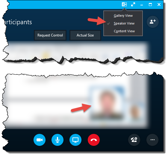
 Skype for Business is an interesting beast. It is a nice little program for internal collaboration, but some of its behaviors are just super-annoying. One my pet peeves is the fact that when you get into a meeting with screen sharing you have a bunch of big heads covering up a sometimes significant chunk of the materials being presented. I finally figured out how to get rid of them. It comes down to the view mode. This little icon in the toolbar:

For some reason, this usually defaults to “speaker” mode where a big picture of the current speaker covers up the lower-right corner.

Switching to “Gallery View” moves the pictures to the top, making incredibly poor use of screen space. Overall Skype, is really bad at getting the UI out of the way to maximize content. Rather, the UI is using as much space as it can…

The true answer is to use “Content View” that removes the pretty pictures and just shows the content.

We still suffer from the idiocy of having a top bar that just says “N participants” and having a single icon on the right… and then another row of buttons to the control the view. Those buttons should also move up to the top bar. And shrink.
I am a professional user using this tool to get the job done. I do not want “pretty” and “consumer-like”. I want “efficient”, “fast”, and “capable”. In this case unfortunately Microsoft have gone the consumer route. I would be much happier if Skype looked like Word with collapsible ribbons and buttons as small a they can get. Maximum area for what is being worked on, minimum UI area.
Update
After I tweeted a link to this article, the Skype for Business team apparently saw it, claiming they would take the feedback into account. That’s very nice of them.
Thanks for sharing this tip. We'll pass your feedback along to our team.
— Skype for Business (@SkypeBusiness) June 2, 2017
how we can used it for business? is it work?